- December 8, 2017
- Posted by: fyber
- Category: Website Design

What is a responsive website design?
Decades ago, websites that were developed for viewing you favorite contents on the internet either had limited designs or lacked in being well-polished. But, those were different times. It’s become past now.
Today, new technologies and methods are being developed and introduced to the world. Such is the case with websites and their responsive designing. Let us understand what is a responsive website? In simple terms, it can be said that a responsive website is developed in such a way that it is easily accessible without the need for further tweaking of your internet browser applications.
Thus, when we speak about a responsive website, it is supposed to be universally pre-optimized for better viewing across different device platforms, such as a desktop computer, laptop, smart-phone, tablet and phablet (it is a tablet with calling feature).
How are responsive websites developed?
When it comes to developing a responsive website, different companies take the lead amongst their competitors. Their approach and methodology make them more prominent in the field of responsive website designing.
Therefore, the approach and methodology towards designing a responsive website include factors, such as coding, click response, touch response, layout, screen size, pixel resolution, panning, scrolling, support for Adobe Flash technology, optimized mark-up, etc. Whmcs theme is a nice example of a perfectly responsive theme, you can use it for responsive website design.
Thus, to make it more clear, it can be said that a responsive website designing is the approach of coding and designing the layout of a website, such that the website helps in providing you with an optimal viewing experience, ease of reading and navigation without the hassle of manually resizing and panning your website on the device that you are using for viewing contents on the internet.
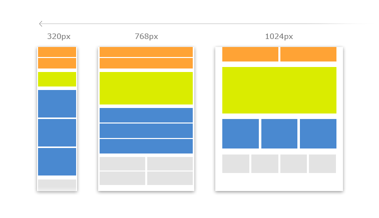 Website designers ensure the effectiveness of website’s screen layouts, navigation elements, multi-media contents, such as images, audio and video and text data to automatically adjust their respective elements on a variety of cross-platform devices.
Top 4 Benefits of A Responsive Website Design
A responsive website saves you time and money in maintaining your website for different devices. This is what makes a responsive website so important in today’s era.
Having understood that, you will also love to know the additional advantages that a responsive website holds both for your personal experience and your business as well.
Responsive websites are utterly very flexible across various cross-platform devices. The text and multi-media contents are automatically resized as per the screen of your device for a much better viewing.
- A responsive website is built with an excellent user interface that gives you a complete peace of mind. You will be amazed by its optimal user interface irrespective of whether you are going to use the website on your desktop computer, laptop, smart-phone or a tablet. You can easily access your website from your favorite device.
- It is very easy to manage your website and SEO campaigns simultaneously instead of having separate websites and SEO campaigns for the same purpose. It has a better optimizing strategy for keywords that are more likely to be searched when you are on your smart-phone or a tablet.
- A responsive website designing is sure to enhance SEO efforts by having all your visitors being directed to a single site no matter what device they prefer to use.
- Lastly, but not the least, a responsive website makes it very easy and efficient for the various online search engines, such as Google to crawl, index and organize the contents of the site.
 Thus, it is necessary for the developers to understand your business needs and help you take your business to a higher level with the introduction of responsive website designing.